In my second year at K-State I took a graphic design course that introduced us to the main responsibilities of being in the graphic design industry: deciding the hierarchy of importance for the information we’re given. This project was one of the more time consuming, as it began on the first day of the semester and lasted until about a week before the semester ended. Each student was assigned a different typeface, required to submit an essay covering the history of their font, and finally, create two mockup posters containing our font and essay.
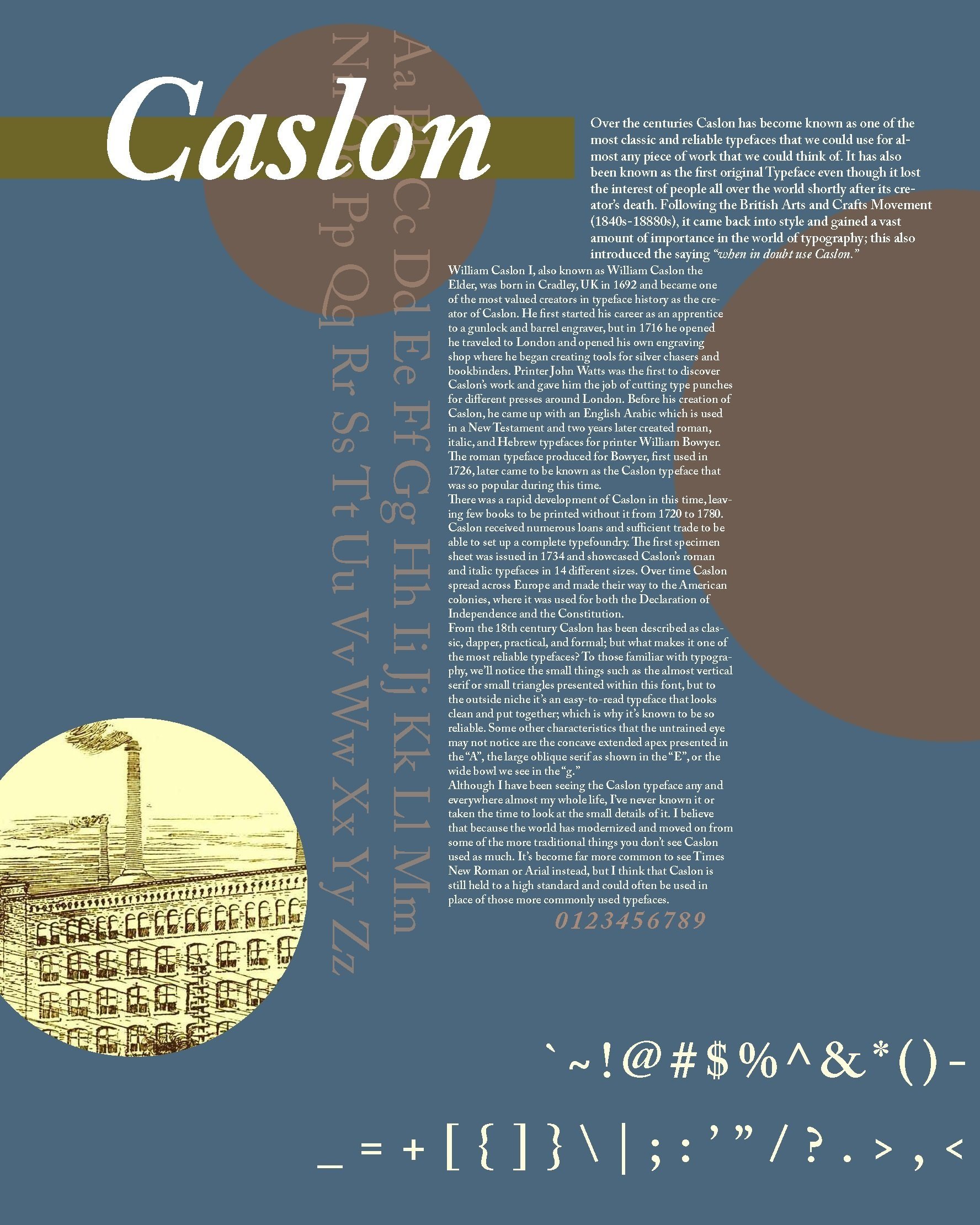
The initial goal for this poster was to create a modernized poster for the Caslon typeface. I chose to use more geometric sequences while still including some imagery to represent when Caslon was invented. This is a very simple design, but still portrays the importance of each element of the font itself.
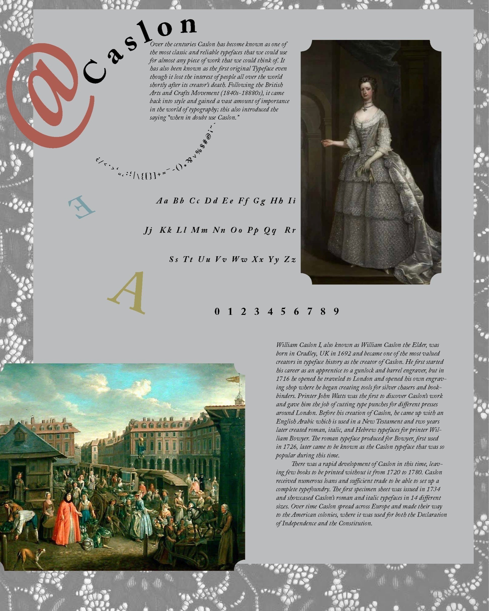
This poster was inspired by the fashion during the time period in which Caslon was invented. I was a very elegant style that was starting to introduce more vibrant colored fabrics, hence the small pops of color throughout the design. I chose to highlight specific characters in Caslon (@, E, and A) by using them as decorative elements because they hold some of the more prominent unique elements of the typeface, such as more notable serifs or stronger curves.